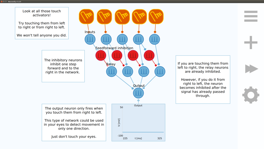
When we started working on Neuronify, we decided to use the same design on desktop and mobile devices to simplify the development process. Although some elements of Neuronify are responsive to different screen sizes, it is pretty clear that the app feels off when used on a desktop computer. Adapting to mobile was favored because it was easier to deliver an acceptible experience on both platforms this way. Having too large icons on desktop is not as bad as having too small icons on a mobile device. Hence, this is what Neuronify ended up looking on a desktop computer:

The buttons to the right are clearly too big if you compare them to the window controls in the upper left corner.
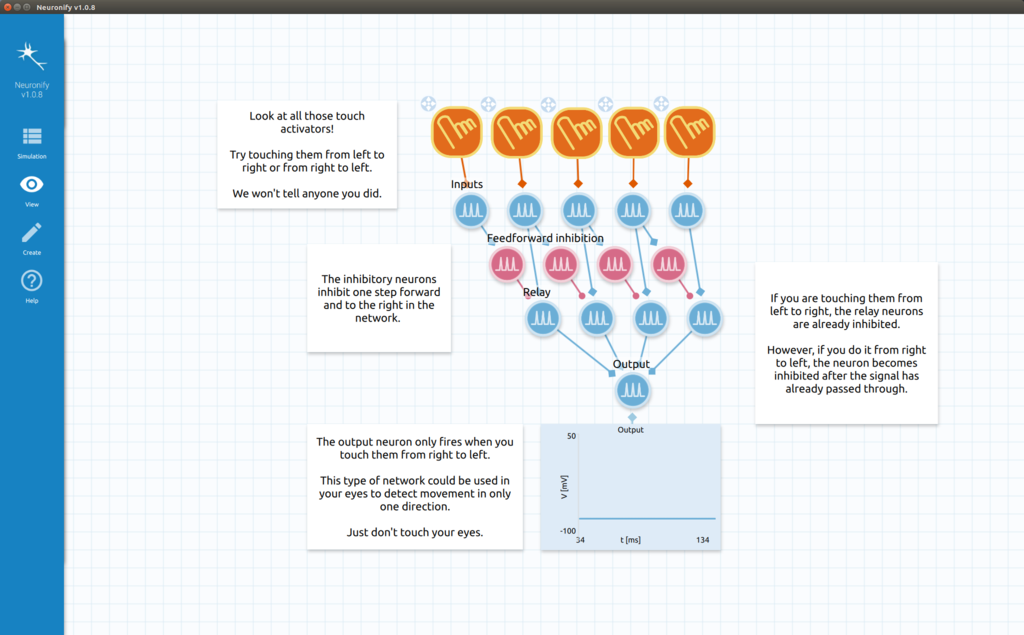
We are currently working on an update to Neuronify which will be designed for use on the desktop. It will both include a new UI layout and new design for the elements. We will also introduce new features in the upcoming versions that have been missed by many of our users, such as saving and loading to custom folders, and undo/redo-functionality.
In a later update, we will also include community sharing of circuits and elements, including organization of shared circuits to be used in courses. We will introduce the ability to lock certain parts of a circuit and define target states to make it easier to create exercises.
The visual differences are not too big and Neuronify should still feel familiar to existing users. However, the new design will hopefully feel like an refreshing update in addition to being much more comfortable to use. Here is a work-in-progress screenshot of the upcoming design of Neuronify:

After this update has been rolled out to desktop users, we will start adapting it to mobile again for a coherent experience between the platforms.